Seattle, WA / Seattle Central Creative Academy, Graphic Design
Antonio
Varchetta
- Graphic Design
- UI · UX
- Illustration

Seattle born graphic designer. This site showcases my work and how I bring classic design principles together with modern vibe coding to build something fresh.
Case studies
All case studies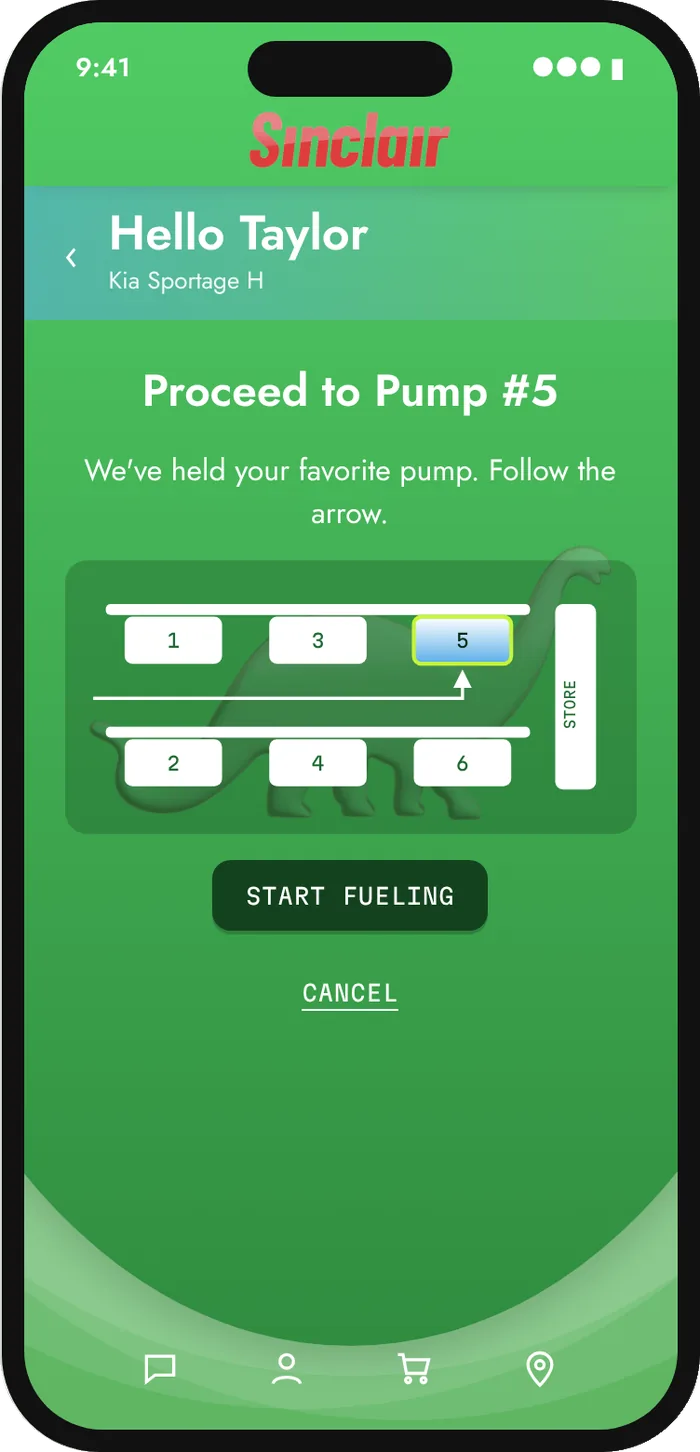
Selected design
All design work
Case studies
Coursework from the Creative Academy at Seattle Central, freelance projects, and UX coursework from General Assembly: research, problem framing and prototypes.
Seattle Central coursework
Creative Academy / Graphic Design
REI: The Collective
REI has developed a brand centered around outdoor recreation with an emphasis on community and environmental awareness. Although they have an events calendar they do not have a way to connect community members within their app.
- Location
- Seattle, Washington
- Services
- UI & UX Design / Product Research
- Timeline
- Two weeks
The Team
I worked with my partner Megan to create this app. My duties involved interviewing, providing support in information synthesis, ideating for the prototype, and working within Figma.
Megan led the branding research, created a schedule and individual role guide, mind mapping, information synthesis, and prototyping.
My Duties
- Create interview questions
- Schedule and conduct interviews
- Synthesize our findings through individual and partner affinity mapping
- Journey mapping
- Research competitors and comparators
- Create wire flows, wireframing, and prototyping
- Deliver the prototype
Our Approach
To understand how we could bring REI closer to the community we interviewed rock climbers of all skill sets, gaining information on their habits, regiments, and motives pertaining to climbing. For two weeks we dove into brainstorming, synthesizing, and ideating a way to harmonize REI and the climbing community. We presented a detailed design and app for REI by the end of week two.
Analyzing Competition
We analyzed competitors in the realm of fitness and outdoor recreation as well as competitors in online retail that also provides group events. We discerned what functions similar companies were using and what we might improve on.
We found that REI only includes events pertaining to their company or companies they worked with. Their calendar only focused on sponsored events. We saw the first flaw in providing valuable information for the community to come together.
My first assumption is that climbers want to see what else could be going on in the community in terms of gym events, climbing events both indoor and outdoor, and possibly even some meetups.
Understanding the Brand
Parallel to synthesizing our data from interviews we did some research on the preexisting website through heuristic and task analysis. From here I wanted to make sure we provided an intuitive landing page for classes that is well organized with proper imagery to depict exactly what each page represented.
In addition I wanted to add more comprehensive information about the classes that REI has to provide. Noting that reviews were a main feature to REI’s online store catalog I decided it would be a great feature for the classes.
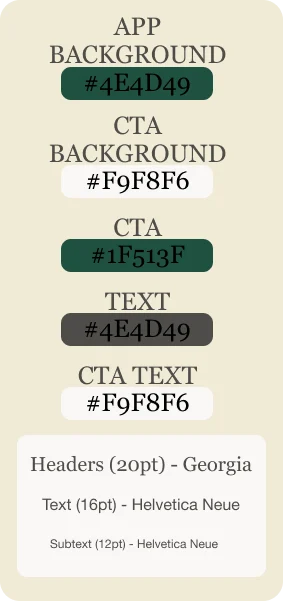
To make sure we matched perfectly to REI’s current design we were able to find their brand catalog and implement their color tokens for text, CTAs, and other essential design principles into our prototype.
Our goal was for anyone familiar with REI’s website or app to have an easier time learning the new features we created. I implemented REI’s color palette for CTAs. REI has two different types for headers (Georgia) and for body text (Helvetica Neue). Adding these curated aesthetics gives users an ease of navigation and promotes learnability.
Talking with the Community
We talked to climbers of all skill sets to find out what is most important to them in rock climbing; why they climb, what brought them to the sport, and what the benefits are.
Our assumptions were that climbers wanted to use technology to track their progress in climbing, find information about outdoor climbs, gain information about fitness, and to learn more about the sport and all its facets.
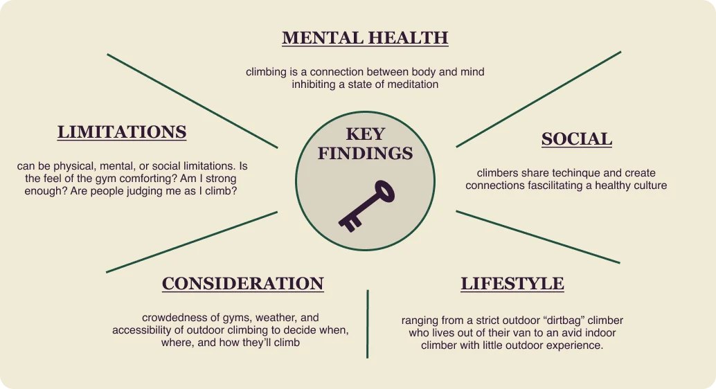
What we did learn is that the climbing community uses climbing as a way to relax and meditate as a form of practicing mental health, to keep active, as well as to socialize with others.
With the use of affinity mapping I was able to pinpoint a few trends:
Meet the User
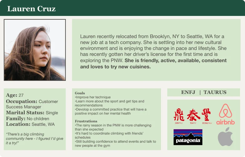
With all of the information gained we created a persona and a journey map outlining the process a climber might go through while using a climbing related app.
After the creation of our main persona we were able to learn that the user may struggle with how they might gauge their current skill level and if that aligns with a class they might choose from REI’s list of classes.
In empathizing with the struggles of branching into a new hobby, looking for activities or new friends can be daunting. I created an understanding of how a newer climber could go about finding a class to partake in to delve into climbing.
We see that Lauren, our main persona, when booking an online course, wasn’t able to take from the information provided about the class if her skill set matches the requirements of the class. I created a CTA with a hover feature that describes exactly what the skill level requirements entail to give the user a sense of security that they will be choosing the right class.
The problem
Climbers need a platform where they can connect with other climbers because engaging with the community helps motivate them to keep up with climbing which improves their technique, mental health, and keeps them social.
Functionality in Design
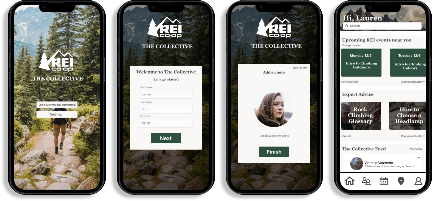
I then created a wireflow to showcase an idea of what a user might see when using the navigation CTAs. We decided that the navigation CTAs would include a home, community feed, calendar, local climbing gyms in the area, and a profile button.
Aligning with our wireflow process we decided on features that would transcend a few different screens. The functions include:
- Option to change location by area code. I wanted the user to be able to change their area in case they are traveling or moved, they would have easy access to resources pertaining to local areas and people.
- Change the sport of interest.
- Interact with user posts such as a like button and user reviews. I created a review system and a like function to posts and reviews to give the user a way to share their personality and personal experience with the community on the app.
Giving Life to the Idea
Prototyping is by far my favorite part of the design process. Creating something and seeing an idea come to life gives me a lot of joy. I also enjoyed working with a company that I relate to. This fueled my excitement for the production of this app.
The most challenging thing about prototyping for this project is not having a lead in a two person group. My partner and my ideas were not always aligning. We solved this by working an equal amount of screens and giving each other feedback until we created one cohesive prototype.
Beyond the Horizons
When we tested the product we observed a few design flaws as well as building on some features to the app. The navigation icons were not well representing what their function was. The testers mainly used the CTAs on the landing page to navigate because of this.
I would like to add a chat feature so users can interact with one another outside of the community posts. One thing I did not build into the app is the ability to look at outdoor climbs near you. Though we did not hear from all of our interviewers that they would use an app to find information on outdoor climbing, a few did.
Adding a way to also showcase REI’s catalog of climbing gear and other climbing related products would benefit REI as a company as well as expose the app’s users to products they are not familiar with or have any exposure to.
Pair Anything
Pair Anything aims to connect restaurants and individuals providing the information needed to pair any drink with any meal.
Currently, Pair Anything provides wineries with the ability to showcase and sell their products to their customers, as well as suggests ‘old world’ cuisine pairing. Pair Anything is also working with Target Wines to integrate pairing suggestions for wines that are sold in store.
In the future, Pair Anything hopes to give sommelier-level food pairings from any cuisine to any drink such as sake, tea, soda, and non-alcoholic cocktails.
Our Challenge
Our team was tasked with revamping Pair Anything’s onboarding process to ensure new users will fully utilize the services as well as understand all functions of Pair Anything’s enterprise portal, generating a returning customer base.
The Team
I worked as the research lead in a team with three others:
- Nicholas Arthwohl as the project manager
- Irfan Ahmed as the design lead
- Natasha Mozgovaya as the planning lead
Initial Objective
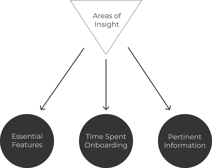
To find out what people expected of the onboarding of a business to business (B2B) service, I talked to managers of restaurants who specifically integrated B2B services in their restaurants. This helped us understand what people expect from an onboarding process and teach us what would cause a user to abandon the process.
Evaluating and processing
Uncorking the Product
Understanding the Competition
I analyzed online competitors within the wine and service industry realm that offer B2B services such as Toast and Clover, two point of sales system providers. Learning from their onboarding we found that they both use a linear onboarding strategy. A linear onboarding strategy guides new users step by step through the onboarding process providing videos and examples along the way.
I was able to observe a few things provided by companies during the onboarding process that gave us insight into our design:
- What aesthetics were essential to attract a new user
- What a comprehensive onboarding process looks like
- What key features should be utilized to keep a user engaged
Analyzing the Service
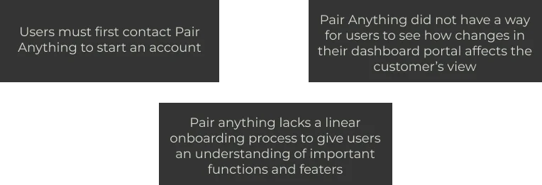
To understand the pain points of Pair Anything’s current users I took the time to go through the onboarding process as a new user to gain insight. Through a heuristic analysis, task analysis, and a user flow I observed these pain points:
Getting to Know Potential Clients
To learn more about the demographic that Pair Anything is looking to appeal to I chose to find people in the restaurant world. I was able to source interviews from my former profession as a General Manager of a fine dining restaurant. Many of my former colleagues are past or current managers of restaurants who work directly with wine as well as have integrated B2B platforms into their business.
To learn from my interviews how Pair Anything can improve their onboarding process I needed to come up with interview questions that answered these goals I set:
- What is the general experience surrounding onboarding a new product or service?
- What are the user’s preferences when onboarding?
- How does the user prefer to receive new information?
- Why do users abandon a new product before completing onboarding?
- What motivates a user to complete the onboarding process?
After gathering all of the data from the interviews I led an affinity mapping exercise with my team which led us to a few key points:
Simplicity
Users want to see simplicity in design and functionality. Simplicity provides users a base perception of what is to come in terms of service and product.
Seeks Help from Product Resources
Users often need help. Questions should be easily answered through a FAQ page, videos providing insight on features, or should be provided with an option to use AI chat or live chat to quickly find answers to their problems.
Prefers Reminders and Progress Evaluation
Users prefer to see some sort of calculation on their progress through the onboarding process. This keeps them on track and assures them of a time frame in which they will be able to complete the onboarding process.
Self-Sufficient
Most users will find their own solutions to their problems by referring to online resources outside of what the service provides. Users will also consult more experienced users before contacting a representative of the service.
“If the onboarding process is super challenging it is a sign for what’s to come.”
Making Sense of Our Findings
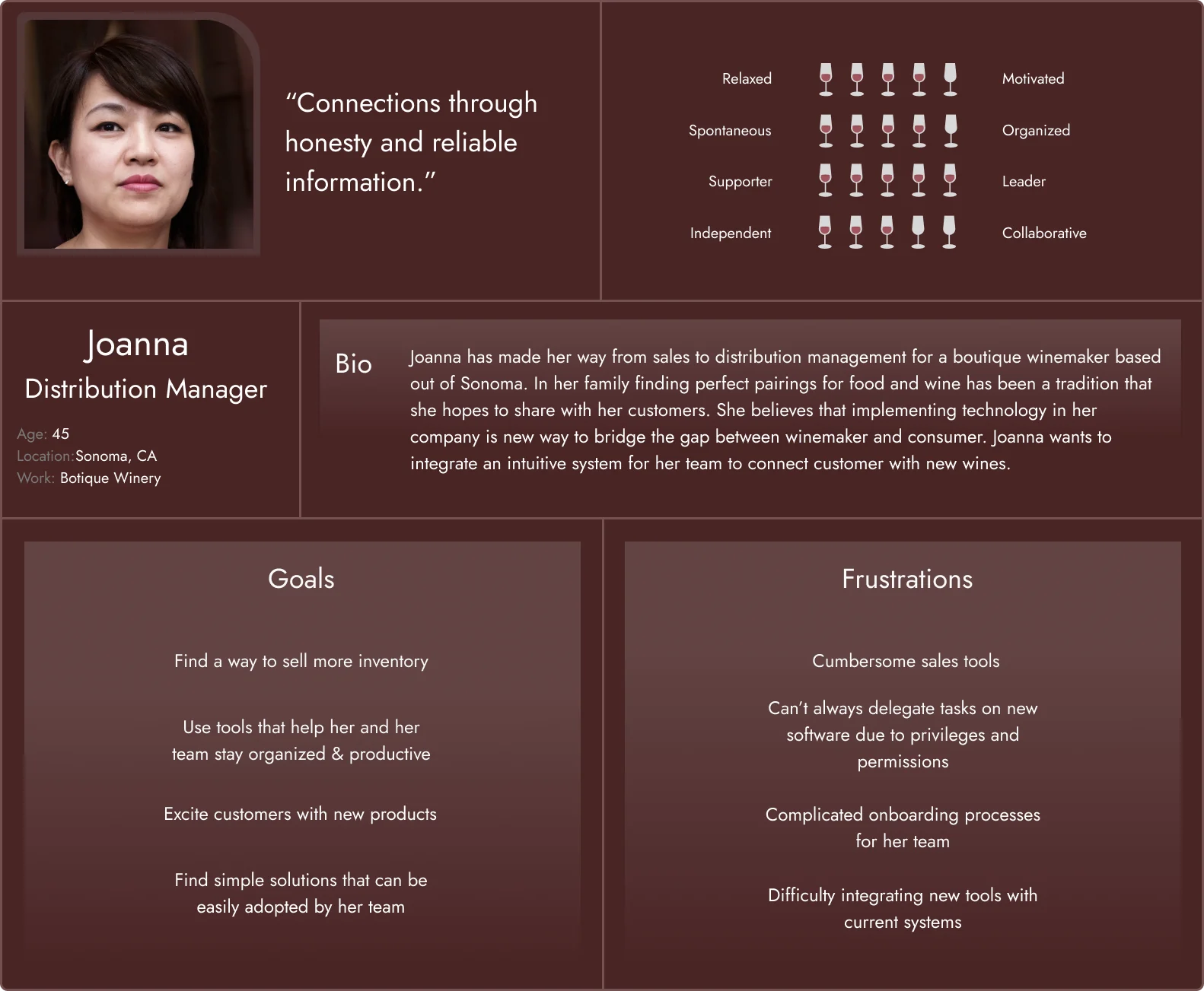
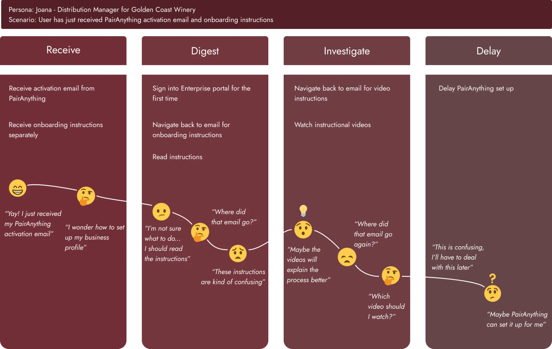
We created a journey map to better understand where in the onboarding process a user would get lost or have questions. To understand where and how a user might struggle in the process I created a persona, Joanna. Joanna is a distribution manager for a boutique wine maker looking to integrate an intuitive system for her team to connect customers with new wines.
We follow Joanna starting from when she receives the onboarding email and link. The email provides some instruction on what to do though vague and with no contact information to ask for help. Joanna is forced to navigate back and forth between email and onboarding as the process is not intuitive, leaving her confused. After watching the instructional videos she finds her questions unanswered, further delaying her onboarding.
We take away from this journey that instructions and videos should reside not in an email but be present during the onboarding process. This ensures the user does not stray away from their task and feels positive about the process.
A User’s Problem
Users who are integrating a B2B platform into their business need a thorough but approachable way to learn how to use new products because they want to feel confident in the tools they employ to elevate their business.
…But How?
Now that we’ve come up with a problem to solve we need to ground ourselves with some ideas on how we might accomplish an effective solution. Again, with all of the information synthesized and laid out, we collaborated and iterated some ideas on potential solutions:
- How might we make the onboarding experience engaging and rewarding for the user?
- How might we facilitate conversation between the system and the user?
- How might we accommodate different learning styles and needs?
- How might we reduce required effort for users?
- How might we help customers understand they are on the right track or completed the task?
Design and prototype
Decanting and Serving
Group Design Studio and Prototype
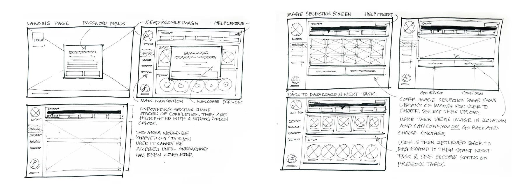
Together as a team we held a design studio. We each took turns sketching in twenty minute intervals iterations of Pair Anything’s current dashboard and what features we think users would benefit from. After two hours of iterating on each other’s designs the design lead presented to the team wireframe sketches with all of our ideas.
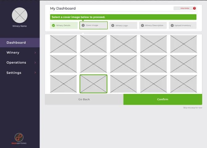
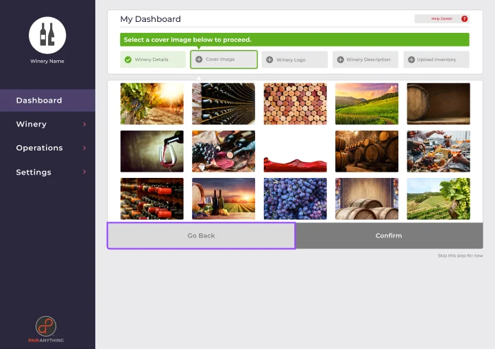
Pair Anything currently does not have any sort of interactive onboarding process or readily available resources for their enterprise portal. The design itself only highlights what the user’s task is at that moment in the onboarding process to minimize confusion.
We put together a linear onboarding process with interactive features and prompts to guide the users. Not all users want to start and end where suggested, so we allowed the users to skip any step at any time.
Our Approach
To ensure that users were given the proper guidance we offer a ‘need help’ button at the bottom of the page for every step of the onboarding process that leads users to the help center. In the help center page users will find frequently asked questions, videos, and tips. There users will also find contact resources for over the phone or email support.
Testing the Prototype
I conducted user interviews in tandem with Natasha, our project planner. We wanted to assess how easily and efficiently users can complete the required onboarding steps for the enterprise portal and locate helpful resources.
I had users walk us through the prototype. Users were asked to describe what they see on the page and direct us through the process out loud. A few key tasks we asked the users to perform were:
- Create a password
- Update winery details
- Upload winery background image
- Upload a logo
- Upload at least one wine
- Find helpful resources
To measure the success of the usability tests we looked at how long it took each task to be completed, whether the user was able to accomplish the task without any questions, the number of errors the user had, and if the user indicated any sense of abandoning the product.
Where Can We Change?
From what I learned from the usability tests I was able to suggest a few changes to the designers.
- To align with users expressing their appreciation for simplicity, I suggested that the background features should be grayed out to emphasize the main actions required
- Give users the ability to fill out required fields in any order
- Add an option to upload a CSV file to make the inventory uploading easier
- Add asterisks next to required fields
What’s next?
Glass Empty
Suggestions
After all was said and done we had some suggestions on what Pair Anything could do to further our rendition of their enterprise portal onboarding.
- Preview of the winery details page in the portal before it’s published. The user could check how it looks, whether there are any typos, and what is missing, instead of going to the website to check the page after it goes live.
- More information about the wine could be added to target new audiences. Do millennials care about wine’s acidity or the mention of ethical sourcing? Could wine reviews from customers bolster the popularity of the product through social validation, in addition to the experts’ tasting notes?
- Suggested collaborations. As the client base grows, Pair Anything could add to the enterprise portal a feature suggesting potential collaboration between different clients, following algorithm-based matches between wineries and restaurants.
Wrist Walk
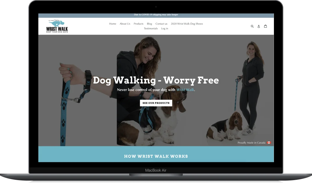
Wrist Walk aims to provide dog owners with a reliable product that insures safety for their furry companion.
- Our goal
- To empathize with shoppers by discovering what pain points shoppers might have while purchasing items from an e-commerce website.
The Scenario
Here’s a scenario for those that might struggle to handle their dog and for those who often find themselves juggling leashes.
You and your dog are on a leisurely walk through the neighborhood. Out comes a squirrel that catches the attention of your dog who decides to lunge after the small and lifelike chew toy. The leash escapes your hand as your dog’s force overpowers your grasp; off down the middle of the street goes your dog, losing sight of it as it chases the squirrel as it runs through the traffic.
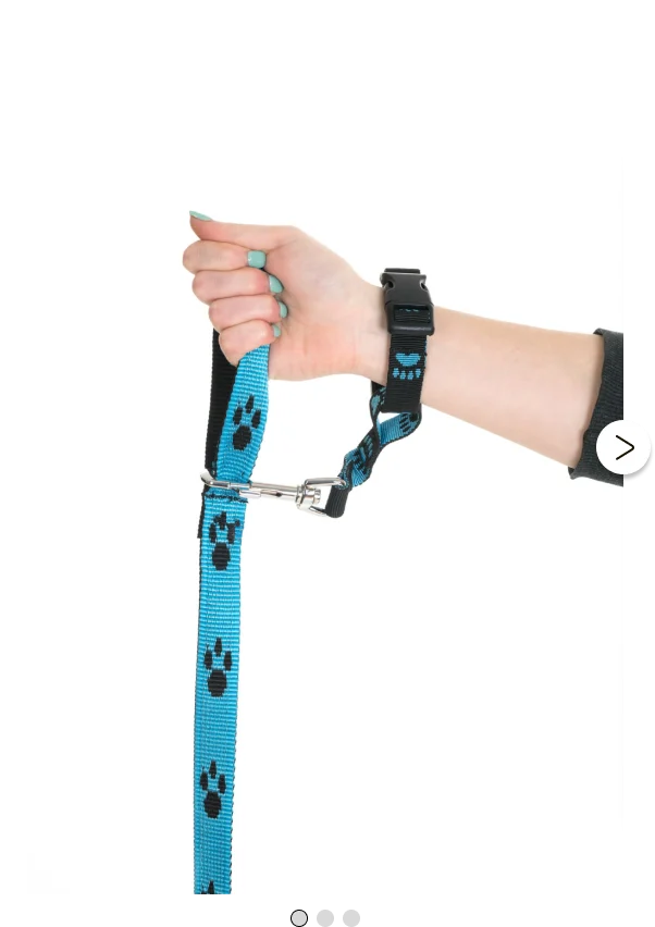
Now with Wrist Walk’s innovative wrist attachment you will never worry about losing grasp of your leash or lose your dog.

My Roles
- Create interview questions
- Schedule and conduct interviews
- Synthesize our findings through individual and partner affinity mapping
- Journey mapping and creating primary and secondary user personas
- Research competitors and comparators
- Create deliverables to hand off to the design team
- Deliver the prototype to stakeholders
- Conduct usability tests
The Process
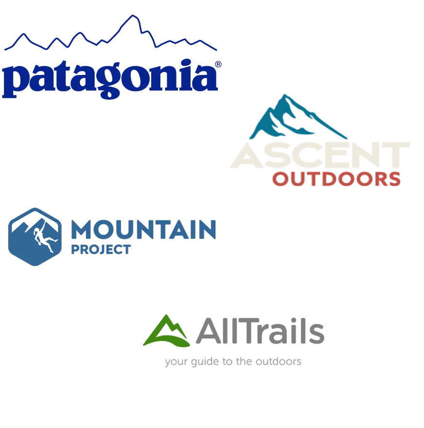
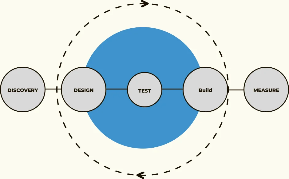
Our team implemented the design thinking methodology, a tried and tested UX framework that helps us:
- Discover and define our users’ problems
- Create and realize those solutions with effective design
- Test them, then build our solution which is then paired with design in a re-iterative loop
- Collate and measure feedback and build in any changes in the design
Part one
Discover and Define
The Approach
In our interviews we searched to understand what some pain points and highlights users experience while shopping and undergoing a checkout process. We targeted pet owners, specifically dog owners, to see what their buying habits are and what makes a positive and memorable buying experience.
Our assumptions are that users want a sleek interface with just the right information to make an informed purchase. We asked our users about their purchasing behaviors, what information they expect to see on a website, and what exactly makes a memorable purchasing experience whether it be in person or online.
A Few Questions
- When going through a checkout process on a website what information do you expect to provide?
- Can you describe a time when you had to shop online for pet accessories?
- What information do you expect to see on the website that might inform your decision to buy the product?
- Can you describe your experience with making a return for an online purchase?
My Findings
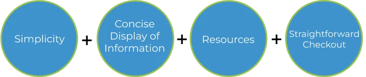
Online shopping is hard especially when looking into boutique shops that one is unfamiliar with. Being able to captivate a shopper and not overwhelm them within a few split seconds as they scan a website is a make it or break it moment.
In the interviews we noticed a few common trends amongst online pet shoppers:
- Simplicity. A simple design makes for an easy to navigate website as well as keeping your user engaged without leaving them frustrated. Users want to be able to quickly understand where to access the information they are seeking. Our interviews informed us that users want to see layouts and CTAs they are familiar with.
- Concise display of information. Users need to see what the brand has to offer to make sure they are getting exactly what they want and expect in the product. In our interviews we came to understand that users want to see sizing guides in metrics as well as photos of the product being worn to inform their purchase. Things like material, washing and general care instructions, and a thorough description are among the things users expect to see.
- Resources. Going through a new or unfamiliar product can be daunting, especially when it comes to returns. Users need readily available information on things like returns, and ways to get advice about the product such as reviews and contacting support. Providing easy access to all of this information creates a sense of professionalism with the brand.
- A simple checkout process. To seal the deal on locking in your customer is the checkout process. In our research we found that users often abandon products if the checkout process is too confusing or the process takes too long. We created a two step process, inputting the necessary information and the place order page. We found that users do not feel the need to create an account for a website that only has two or three products, like boutique shops such as Wrist Walk, but would rather get what they want easily and quickly.
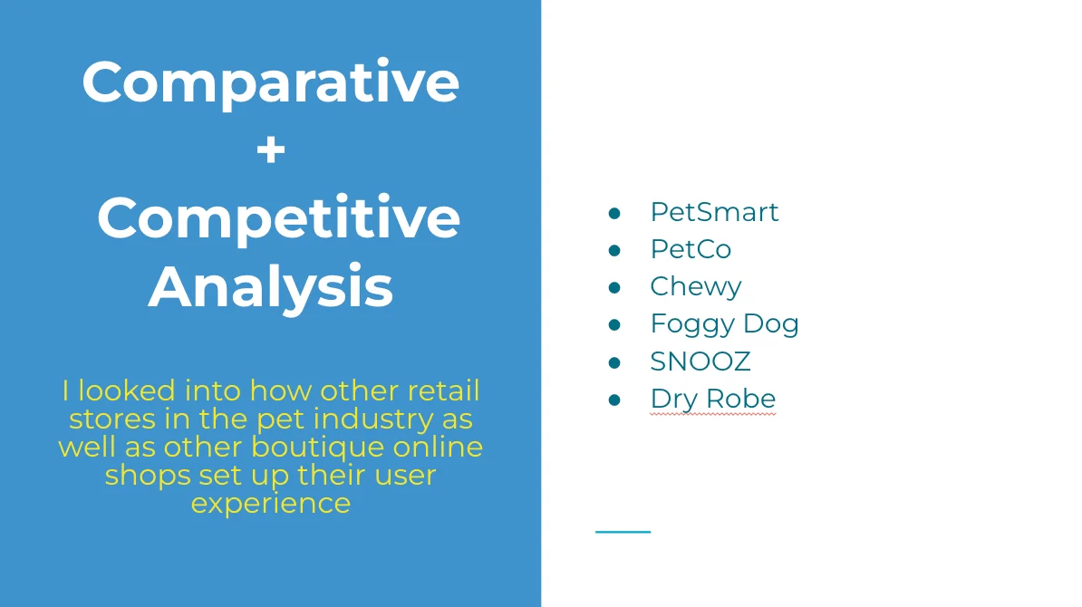
Comparative and Competitive Analysis
Through a feature analysis and a task analysis we found what features were pertinent and common amongst all of the e-commerce websites we looked into. Some features we noticed are:
- Options to hover over the product photos to enlarge them for a better look at products
- A star rating system that when clicked brings you to the product reviews
- A quantity input option in the product page and on the initial checkout screen
- Color selection option that changes the product photos to match the color selected
- Scrolling option for product photos
User Persona
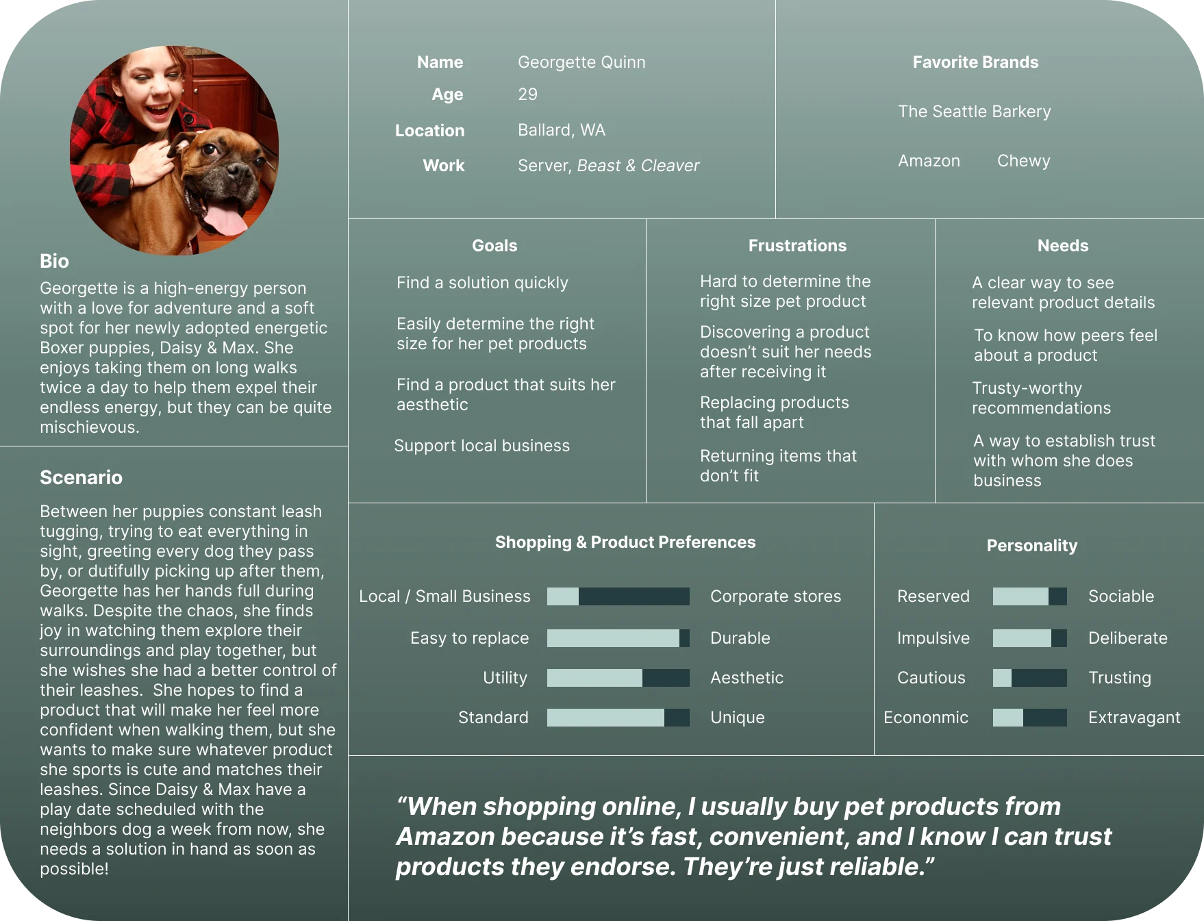
To further synthesize our data and really empathize with a user we created a user persona. Meet Georgette. She has recently adopted two highly energetic puppies. She hopes to find a product that helps her manage both of her dogs as she has their first play date coming up soon. Georgette is looking to shop for something local and fashionable, but does not want to go through the hassle of returning or replacing something last minute for any reason. She struggles with finding the correct sizing for many dog products and finds that many products are not what they advertise.
Problem statement
Pet owners need a simple and familiar way to identify and purchase the right pet accessory because they don’t want to deal with the hassle and disappointment of returning or replacing their item.
How Might We?
How might we create familiarity in a brand that instills a sense of security when purchasing a product?
- 01How might we help customers make a purchase confidently?
- 02How might we instill confidence in product sizing?
- 03How might we simplify the checkout process?
- 04How might we help pet owners make informed decisions?
Design Studio
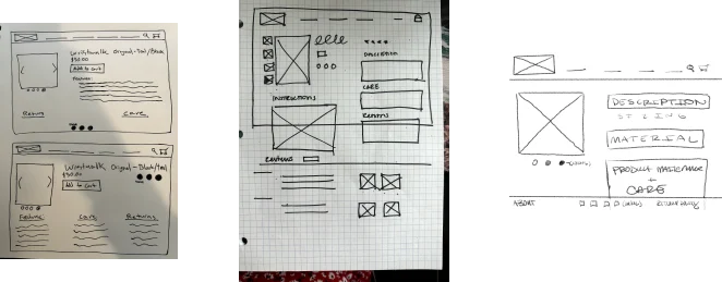
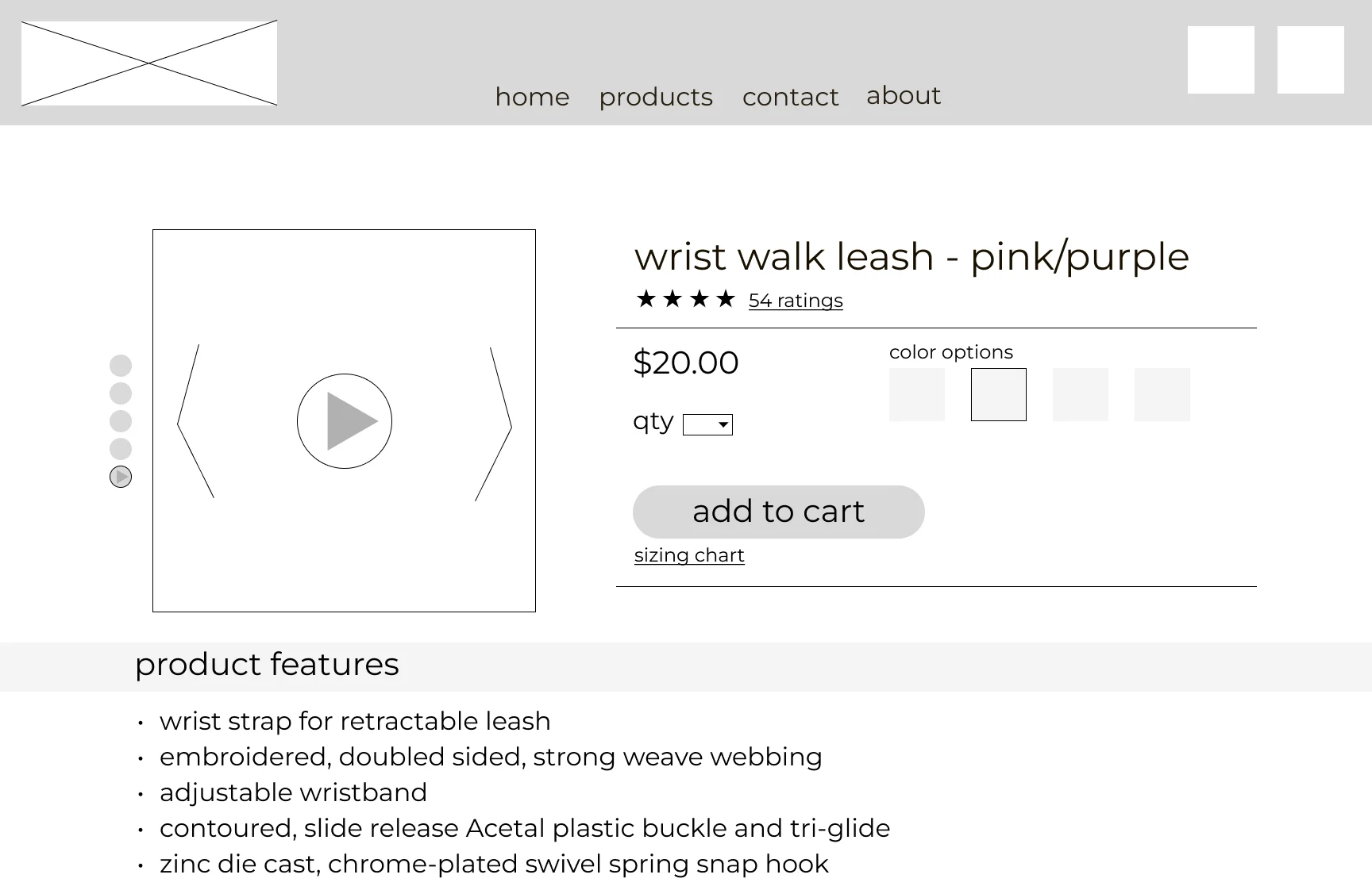
Using my How Might We statements both the research team and design team took turns creating and iterating low fidelity wireframe sketches using Figma’s FigJam application. This helped the design team gain insight on how to move forward to produce a high fidelity prototype.
Iterations
This iteration displays a few familiar features to give users a sense of ease while navigating the product page. We wanted users to be able to instinctually navigate the page to lessen any fatigue or discomfort while taking in new information.
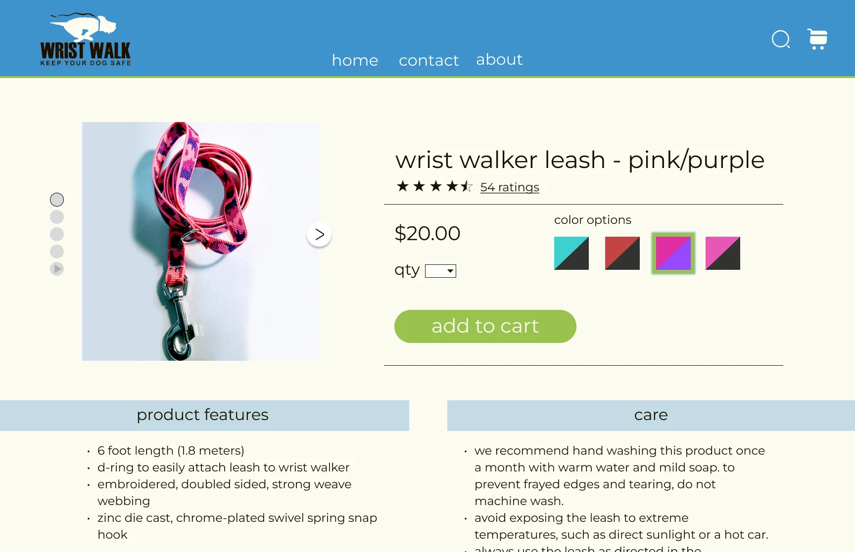
In our high fidelity prototype we showcase features that allow users to comfortably navigate the page accompanied with the proper information to make an informed decision. Some of the key features we chose to include to instill trust in the product are:
- Extensive product care information to inform users of how easy it is to clean and maintain their pet product, products that are subject to extreme wear and tear
- Product features to let shoppers know of the high quality materials used in Wrist Walk’s product
- An easy and recognizable way to navigate the product’s multiple color features and photos
- An easy way to add any quantity of a product to the cart
End of the Leash
As I ran tests for the new product page I found that people navigated using the new UI. The testers mainly used the functions provided, solidifying our research and our implementation of our findings.
I believe a feature to add would be a number hovering near the cart icon once the user has added items to their cart. This would give the user insight on how many items they have added while shopping without having to take the extra step to get back to the cart.
Suggested items that others have purchased would be a feature to consider, giving users more options in less time scrolling.

Sinclair ReimaginedDesigning a cardless gas station for 2030
What if paying for gas took one tap, or no tap at all? Over six weeks my team reimagined Sinclair for 2030: a station that recognizes you when you pull in, bills you without a card swipe, and turns EV charging time into a break worth taking.
- My role
- UX research, payment technology research, kiosk and app wireframes, coded prototype
- Team
- Antonio (me), Taylor (type, color and aesthetics for the branding system), Sean (brand identity, logo redesign and station layout)
- Course
- DES 153 UX Strategy, Seattle Central Creative Academy
- Tools
- Figma, Figma Make, Google Slides, Claude (vibe coding)
The Challenge
Paying for gas is stuck in the past, even though Wi-Fi, Bluetooth and RFID could easily recognize a regular customer. The brief asked us to pick one major U.S. gas brand and prove that a better experience could change how people feel about it.
We chose Sinclair and had four jobs to do:
- Improve the payment experience, including how the station recognizes returning customers
- Increase food and drink sales
- Redesign the station layout to accommodate electric vehicles
- Redesign the logo, the physical pump and the supporting graphics
The brief was blue-sky: what if a gas station felt more like REI, Starbucks or the Apple Store?
Why Gas Stations Feel Like a Chore
I led research for the project, starting with a simple question: what makes a gas stop stressful? The answer was rarely the gas itself. It was everything around it.
- The pump fights you. Low-contrast screens wash out in sun glare, and worn buttons need several hard presses just to enter a zip code.
- Payment is slow. A stop can mean pumping, re-parking, then waiting in line inside.
- The basics fail. Bathrooms are dirty, locked behind a key, or out of supplies.
- The food doesn’t fuel you. Processed snacks are a poor fit for long road trips.
- EV drivers wait with nothing to do. A 20+ minute charge often means standing in the sun.
- No brand stands out. Most stations look the same, so there is little reason to be loyal.
The mission
Effortless. Personal. Seamless.
Five Pillars
We turned the research into three goals: make the visit effortless, make the brand feel personal, and remove the physical act of paying. Less friction at checkout means a calmer customer, and a customer who spends more. From there we defined five pillars.
- Invisible transactionsPaying feels as easy as a mobile order.
- The market upgradeQuality food instead of an aisle of neon snacks.
- Anticipatory loyaltyThe station remembers what you like.
- The premium pauseEV charging time becomes a comfortable break.
- Zero-guesswork interfacesA first-time visitor never feels lost.
Meet the Road Trip
To test these ideas we mapped one journey: parents on a road trip with two young kids. Their stop starts anxious, with “the kids are getting hangry,” and turns reassured when the app shows a nearby station with their go-to meals in stock and no wait.
At the pump they order snacks on the screen and pick them up at a to-go window. They leave relieved: “We didn’t even have to argue in the candy aisle!”
Designing a Cardless System
I researched the back-end technology that would make invisible transactions real. The system had to answer two questions: how does the station know who you are, and how can payment disappear from the visit entirely?
Recognizing the customer with two triggers. Relying on one technology would create a single point of failure, so I layered two:
- RFID recognizes the vehicle. A tag on the windshield activates the pump the moment the car pulls in. It works even if the driver’s phone is dead or the app is closed.
- Bluetooth recognizes the person. Beacons around the lot and inside the store ping the Sinclair app. This covers the edge cases: a rental car, or a driver who walks over from the EV lounge.
A fully cashless, cardless visit. We made a deliberate choice: no cash, no cards, no checkout. A customer rolls in, the app recognizes them, they fuel up, collect their food and drive away. The card saved in their profile is billed automatically for everything in the visit, gas and snacks together. They never have to think about payment unless the app prompts them.
Behind the scenes, a profile database matches each signal to the customer’s payment method, vehicle and past orders. An inventory connection lets the pump screen show what is in stock, so customers can order snacks while they fuel.
The idea
Roll in, get recognized, fuel up, grab your food, and drive away. Payment just happens.
The App and the Kiosk
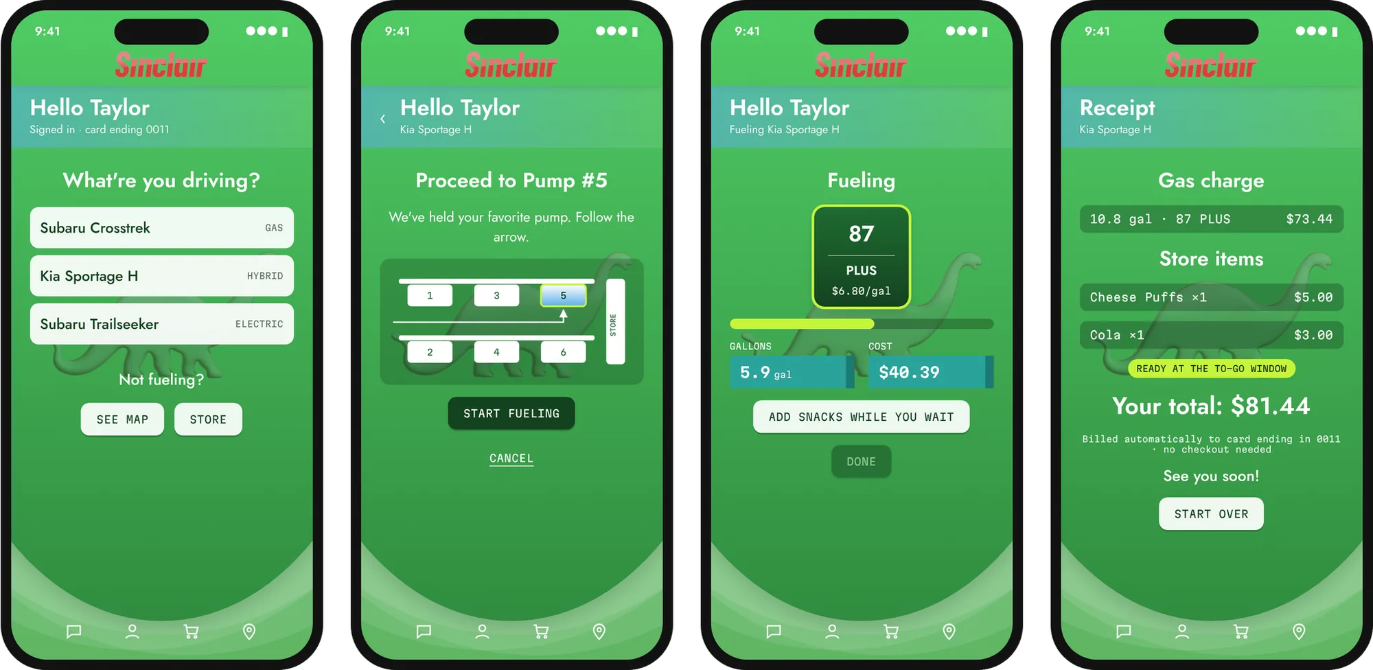
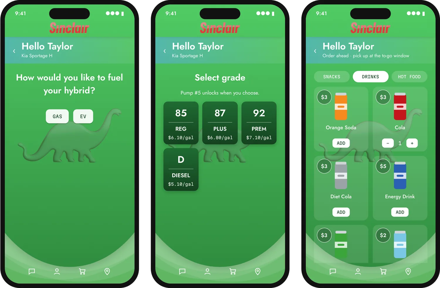
I designed the checkout flow for two surfaces, the Sinclair phone app and the screen on the pump, using a sample customer named Taylor. My test for every screen: could someone who has never visited the station get through it without help?
In the app, each step asks one question. Choose your car, choose gas or EV for a hybrid, head to the pump the map points you to, pick a grade, then watch the gallons and cost count up. One receipt covers fuel and store items together.
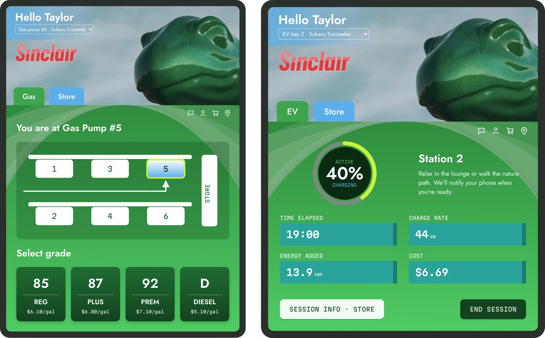
The pump screen mirrors the app, so the experience is the same with or without a phone. Gas, EV and Store tabs sit at the top. The EV screen shows charge level, time, energy and cost at a glance, and the Store tab lets customers add snacks, drinks and hot food while they fuel.
- A map instead of a number. “You are at Gas Pump #5” sits above a diagram that highlights your pump, which removes the guesswork of finding it.
- One receipt for the whole visit. Fuel and snacks appear together, which reinforces that payment just happens.
- Personal from the first screen. A greeting by name and a saved vehicle signal that the station knows you.
From Sketch to Working Prototype
I built the experience the classic way first, then brought it to life with code.
- Hand-drawn wireframesI sketched each screen on paper to solve the logic before any visuals: what the customer sees, in what order, and where they might get lost.
- Iterating in FigmaI turned the sketches into wireframes for the app and the kiosk, then refined them alongside the team’s brand system.
- Vibe coding with ClaudeI described the flows to Claude and iterated on a working prototype, matching the gradients, logo and dino artwork from our Figma files.
Static screens show what the app looks like. A working prototype shows how it feels: the gallons counting up, the charge ring filling, and a total that arrives without a checkout step. Try it below. Switch between the phone app and the pump kiosk at the top.
The Bigger Picture
My screens were built on the brand and station work my teammates created.
- Type, color and aesthetics (Taylor): the old serif type felt dated and the colors were used inconsistently. The new system pairs Jost for headings and body text with Martian Mono in all caps for calls to action, and adds blue to the palette as Sinclair moves toward EVs.
- Brand identity, logo and station layout (Sean): a refreshed Sinclair logo that keeps the dinosaur, and a station plan with a solar canopy, a playground, a fenced dog park, walking paths and a Wi-Fi lounge for EV drivers.
- The mascot: Dino anchors the loyalty experience, from branded food to short story-driven ads that replace loud pump commercials.
Reflection
We presented Sinclair Reimagined as a full pitch covering strategy, UX, architecture and brand. Three lessons stayed with me:
- Customers remember how they felt. The emotional arc of the family’s journey mattered more than any single feature.
- Fix the pain points, then amplify the highs. Clean bathrooms and fast payment come before any delightful extras.
- Tech that streamlines spending is a win-win. The same system that saves customers time also raises store sales.
What I’d do next: run focus groups and usability tests on the app and pump screens, validate our goal of cutting pump transactions from about 60 seconds to under 15, test how customers respond to a fully cashless station and who it might leave out, and plan a budget to scale the design across regions and station sizes.
Student concept for DES 153 UX Strategy. Not affiliated with or endorsed by Sinclair Oil.
Design
Freelance and personal projects made digitally: illustrations, lettering, logos and posters built with Adobe Suite, Figma and Procreate.
About Antonio

Antonio is born and raised in Seattle hailing from the Ballard neighborhood, born into an Italian family of chefs and artists. Antonio found his passion for art at an early age from the culinary background of his parents and from his nonno Pasquale who painted with oils on canvas and hand carved figures to make large scale dioramas. Aside from family influence, Antonio’s inspirations for creating are centered around the years of traveling through many different countries discovering culture, embracing street art, enjoying the scenery of each destination, and experiencing the wildlife harbored by each terrain.
Outside of his passions for food, art, and travel, Antonio is captivated by the mountains and forests of the Pacific Northwest. He finds passion in foraging for mushrooms, exploring the crags and large mountain faces utilized by the climbing community, enjoying the peace and tranquility of the quiet outdoors in contrast to his time spent in the bustling cities of the world.
Antonio’s works encompass the communities and influences of nature he has experienced through the years. His works experiment in tying realism with the abstract nature of organic shapes. Antonio’s current focus is centered around graphic design and street art inspired pieces of work, though he will always continue to express his passion for the outdoors.
- Studying
- Graphic Design, Creative Academy at Seattle Central
- Practice
- Graphic Design, UI · UX, Illustration
- Tools
- Figma, Procreate, Adobe Suite, AI Tools
- Languages
- English, Italiano, Español